Project Description
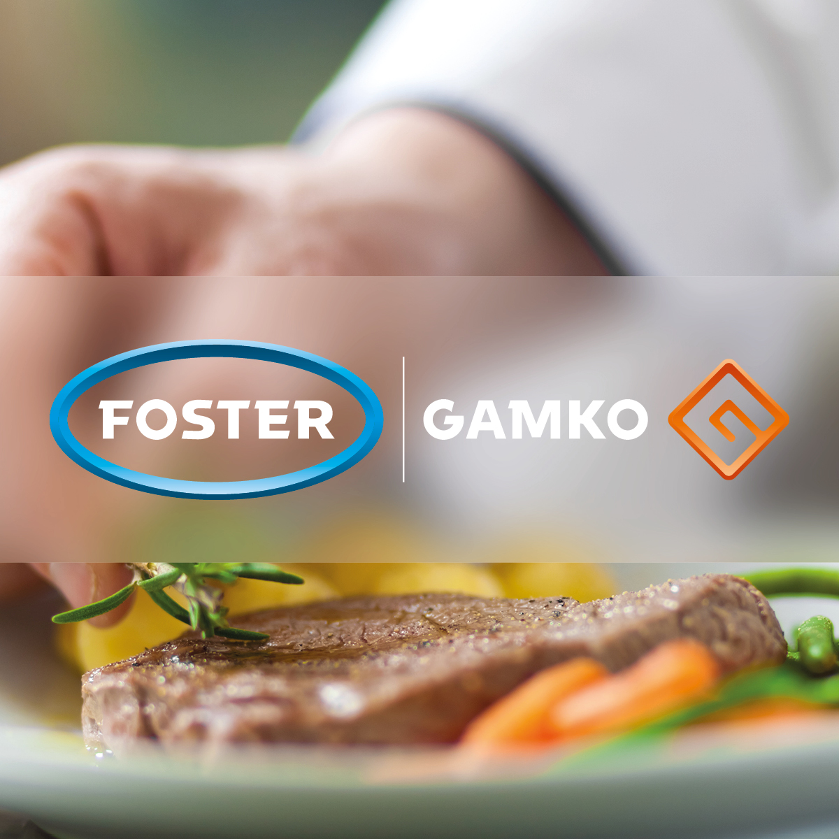
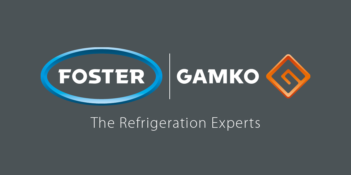
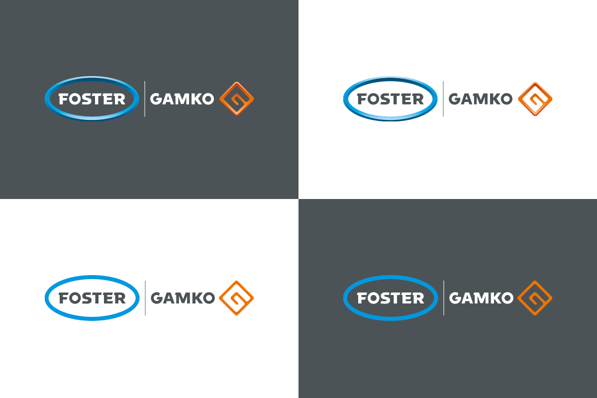
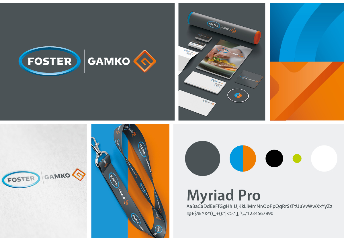
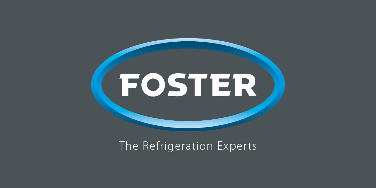
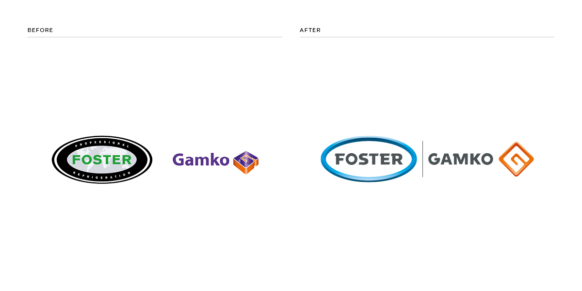
Foster Refrigerator & Gamko are world leading manufacturers of refrigeration for commercial kitchens and bars.
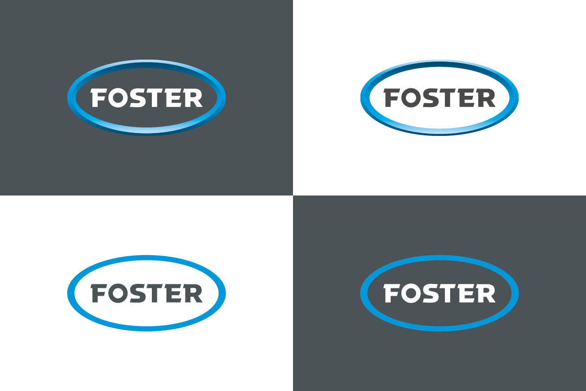
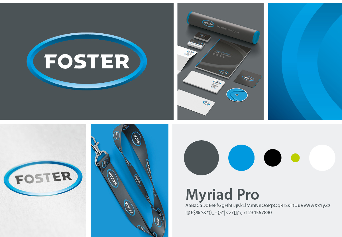
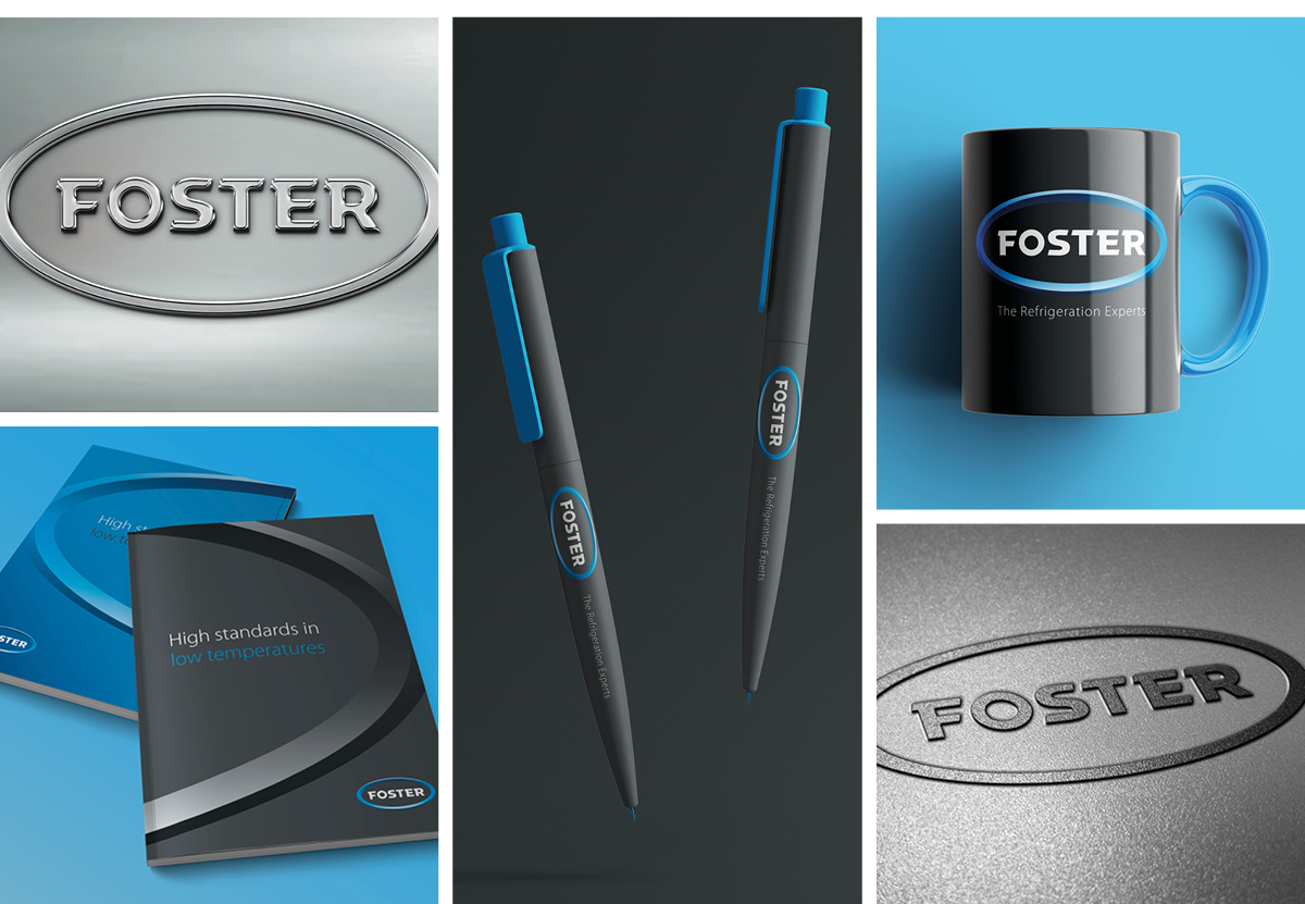
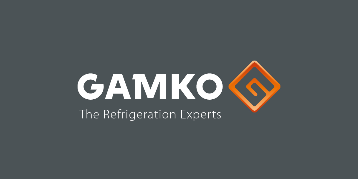
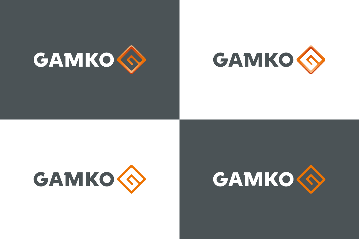
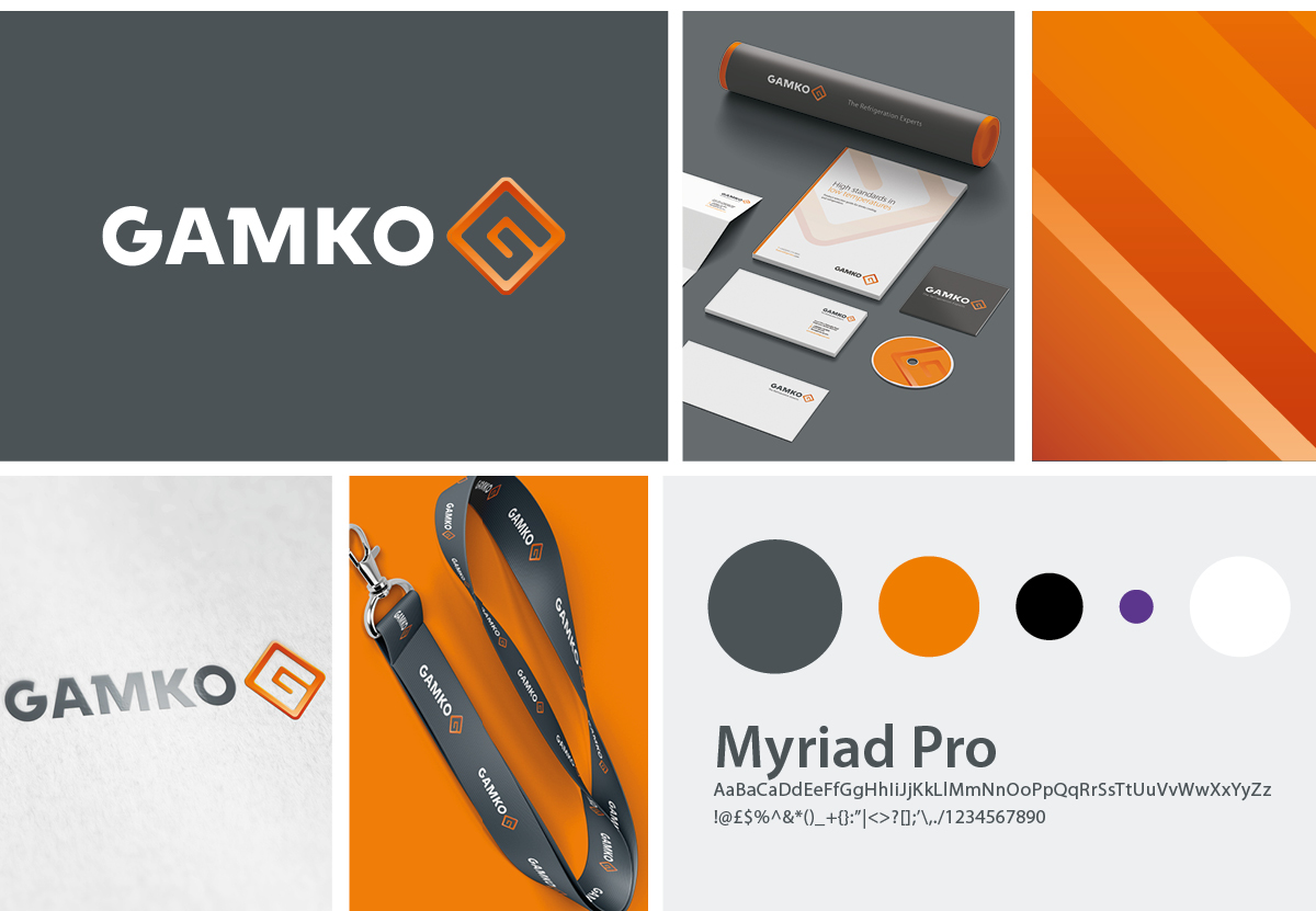
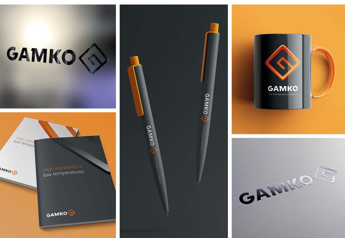
Our brief was to make the two companies logos look more combined and considered as one logo. Our approach was to create a typography style for both names so they have a visual consistency, then designed modern interpretations of their existing marks, the ‘globe’ oval for Foster and the historical ‘G’ for Gamko, with a graphic treatment that matched.
We thought it was important to keep the strong colour palettes for each brand (blue for Foster, Orange for Gamko), but brought unity to the design with a grey background colour.
The new identity for Foster | Gamko pays gentle tribute to both the company’s heritage whilst also looking forward in a more modern, brave and exciting way. We are very proud to have created the new identity for such a high profile business.
Project Details
Client: Foster Gamko
Service: Branding, Logo design, Design